VERONICA STRANDELL
VERSATILE DESIGNS
LOGOS & SYMBOLS
Click on each to learn more

A symbol was developed for a recurring event organized by SWEA International, designed to reflect the organization’s visual identity through the use of its official colors, fonts, and logo.

A brand guide ensures consistency by defining the colors, fonts, and design elements that keep a symbol or logo visually cohesive across all uses.

The logo was designed to reflect the product and features the customer’s own handwriting, as a personal touch was important to the client.

A brand guide ensures consistency by defining the colors, fonts, and design elements that keep a symbol or logo visually cohesive across all uses.
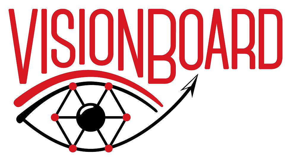
The logo incorporates the six pillars of the company’s core statements and visually represents the values of VisionBoard, while maintaining a clean and cohesive design.

A brand guide ensures consistency by defining the colors, fonts, and design elements that keep a symbol or logo visually cohesive across all uses.

This logo was developed for a consultant who wanted a polished, professional identity for use on correspondence, invoices, and other materials. Through thoughtful selection of colors, fonts, and shapes, the design was refined to meet the client’s preferences and create a cohesive, professional look.

A symbol was created for a monthly webinar to attract the organization's members and increase visibility, while fostering recognition and familiarity with the event.

This symbol was created for the organization’s yearly announcement of “Swedish Woman of the Year” to strengthen the event’s visual identity and convey its importance and prestige.